Swiss Wine, the brand
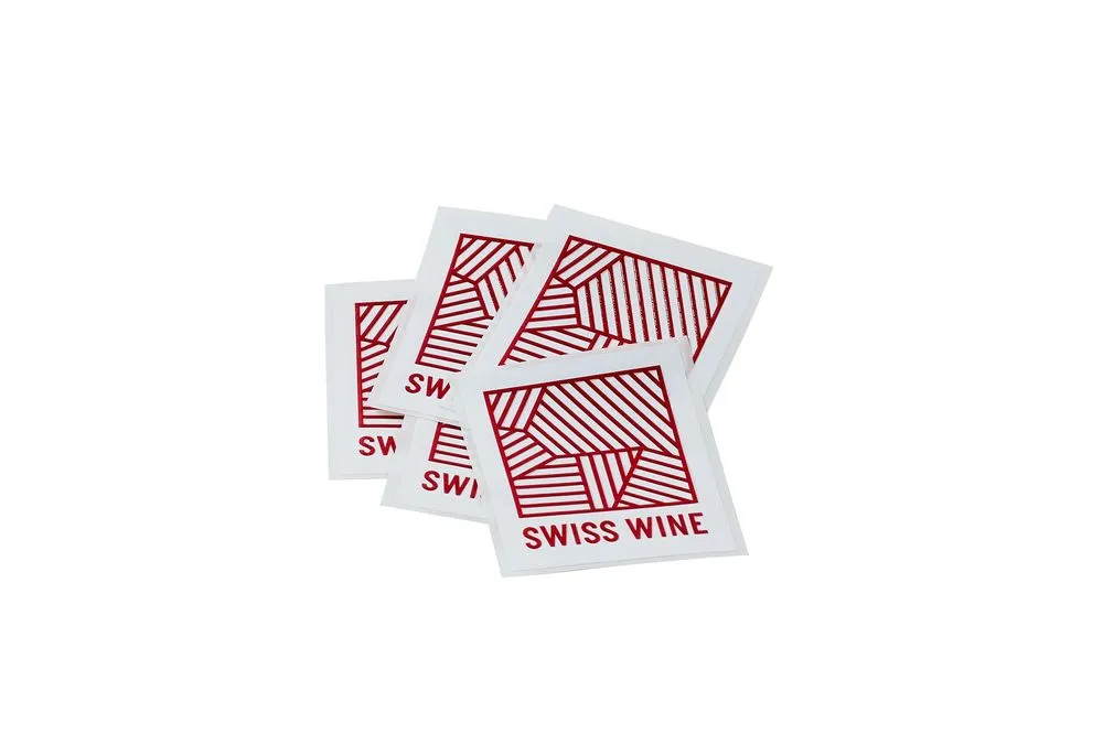
The red and white Swiss Wine logo, identity colours of Switzerland, underlines "Swissness" and recalls the 6 wine regions. It was created in 2014 by entrepreneur, journalist and designer Tyler Brûlé.
Fragmented vineyards
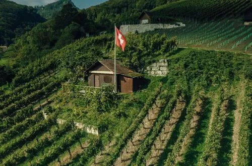
The Swiss vineyard terroir was a source of inspiration. The motif used for the logo and the visual identity refers to the well-ordered terraces of the vineyards and the fragmented patchwork of the terroir seen from the sky. It also illustrates the complex nature of the Swiss wine industry, with its array of small independent vineyards.

The Swiss influence influences
There is no Swiss cross in the logo. There are few symbols that convey the image of Swiss quality so succinctly. The idea was to keep some elements of the Swiss cross and use them in a new and subtle way. The logo's square shape and colour symbolise Switzerland. But if you look closely, you can see a graphic representation of the six wine regions.
Logo development
The lines represent the vineyards, and the colours, in addition to being those of the Swiss flag, represent the grapes: red and white. Combining these elements with bold, clean typography results in something that represents complexity, the search for perfection and superior quality.
Pretium
Related Articles
All the news about Swiss wines and exclusive reports.
To visit our site, you must be of legal drinking age in your country of residence.


